
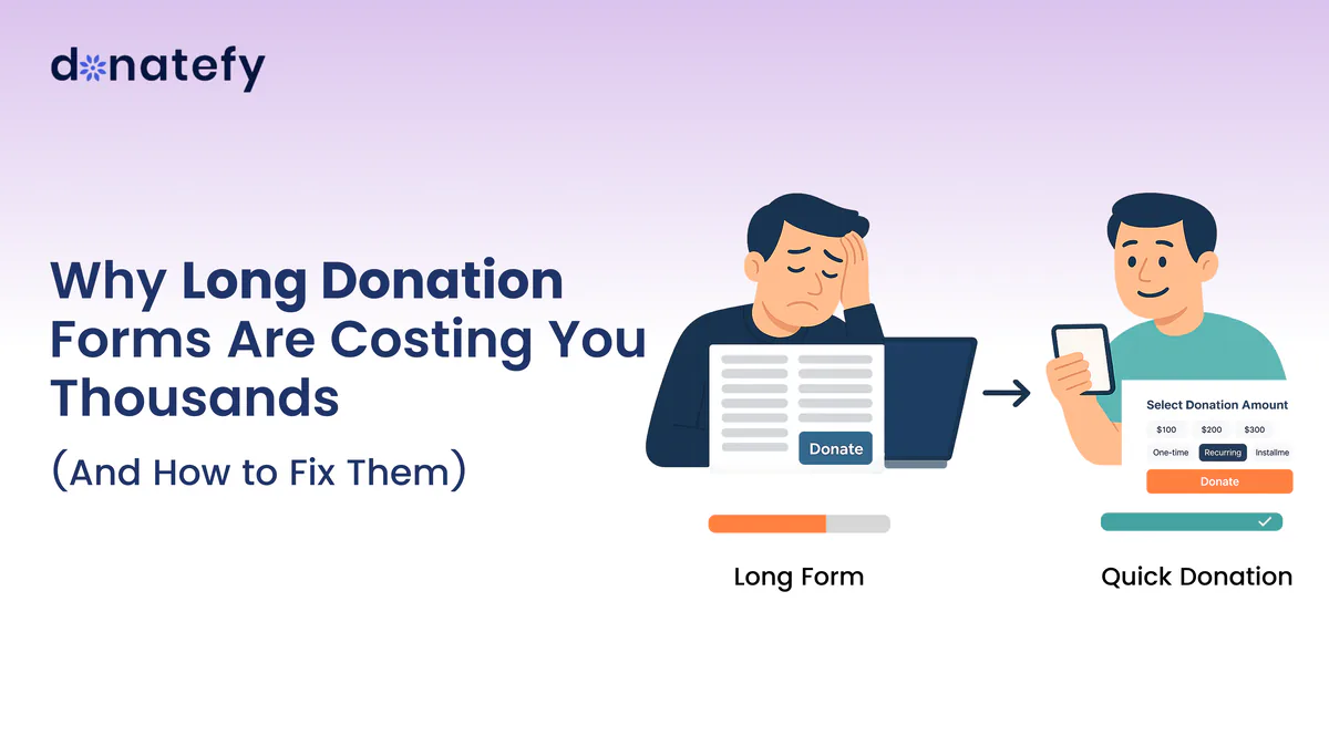
When someone lands on your donation page, they are already halfway committed. They care about your cause, they want to help, and they are ready to give.
Then the form begins. Every extra field, every unnecessary click, and every confusing step gives that person another chance to stop. Each abandoned form is a gift that would have funded your programs and reached the people you serve.
So why are long donation forms so damaging, and what can you do about them?
The hidden cost of long donation forms
1. Donor fatigue sets in quickly
Picture a supporter who is excited to give, then meets a wall of questions. By the time they reach the end they are frustrated, or they have already closed the tab.
2. Mobile donors drop off
Many donors arrive on a phone. A long form is harder still on a small screen, with tiny fields, a keyboard covering half the page, and a lot of scrolling. It is the same problem micro-moment giving solves in person: a gift has to fit into a few seconds.
3. Complexity erodes trust
When a form asks for details that seem unnecessary, donors start to wonder why you need them. Simplicity builds trust; complexity chips away at it.
4. Every extra step costs you gifts
Each field you add is one more decision between intent and a completed donation. Across every visitor to your page, those small losses add up quickly.
Donation form best practices that fix the problem
Improving your donation form is one of the fastest ways to raise more without spending more on marketing. Here is where to start.
Keep it short and simple
Ask only for what you truly need: the amount, the donor's name and email for the receipt, and payment. Make everything else optional, or ask for it later.
Design for mobile first
Make sure the form works on a phone before anything else: large buttons, few steps, and no endless scrolling.
Offer quick payment options
Put Apple Pay and Google Pay up front, alongside cards. A donor who can confirm a gift with a glance or a fingerprint never has to type a card number on a small keyboard.
Give flexible giving options
Let donors choose a one-time or monthly gift in the same flow, and offer suggested amounts with a custom option, so the decision takes seconds.
Divide longer forms into clear sections
If you genuinely need more information, group it into short, logical sections such as "Your details" and "Payment." Breaking a form up makes it feel lighter and keeps donors moving forward.
Where Donatefy comes in
Donatefy is built around short, mobile-first giving. On the E-Fundraiser and every campaign page, checkout collects the gift, the donor, and the payment in one short flow:
- Quick Donation. Suggested and custom amounts for supporters who already know what they want to give.
- Express payment. Apple Pay and Google Pay up front, with cards, Link, and ACH bank transfers for everyone else.
- Flexible frequency. One-time or recurring giving, chosen at checkout.
- Only the fields you need. The Campaign Builder decides which donor fields each campaign collects, so a quick appeal can stay quick.
- Your own website. Embedded donate buttons and campaign components for the site you already have.
- An instant receipt. A confirmation and a branded, tax-ready receipt after every gift.
When a campaign really does need more than the essentials, donation forms add custom donor fields and campaign selection on Growth plans and above. In the Admin Portal, the dashboard shows gifts by channel and performance by campaign, so you can see which appeals are working and adjust quickly. Every donation is processed by Stripe and settles into your organization's own Stripe account, and full card numbers are never stored on Donatefy servers.
Make every donation count
Your donation form is not a technical detail. It is part of how you raise money. Long, complicated forms create friction and frustrate donors, and the gifts they lose never show up in any report.
Donors do not give because of your form. They give because they believe in your cause, so do not let a clumsy form get in their way. For the other common reasons people hesitate, read 5 reasons people don't donate, and how to change that. Before your next launch, check this list of common donation campaign mistakes.