
When someone lands on your donation page, they’re already halfway committed. They care about your cause, they want to support, and they’re ready to give.
But here’s the catch: every extra field, every unnecessary click, and every confusing step in your donation form increases the chance they’ll abandon the process. In fact, research shows that nearly 60% of potential donors drop off if the donation form is too long or complicated.
That’s money left on the table, money that could have fueled your programs, helped more people, and grown your impact.
So why exactly are long donation forms so damaging, and what can you do to fix them? Let’s dive in.
The Hidden Cost of Long Donation Forms
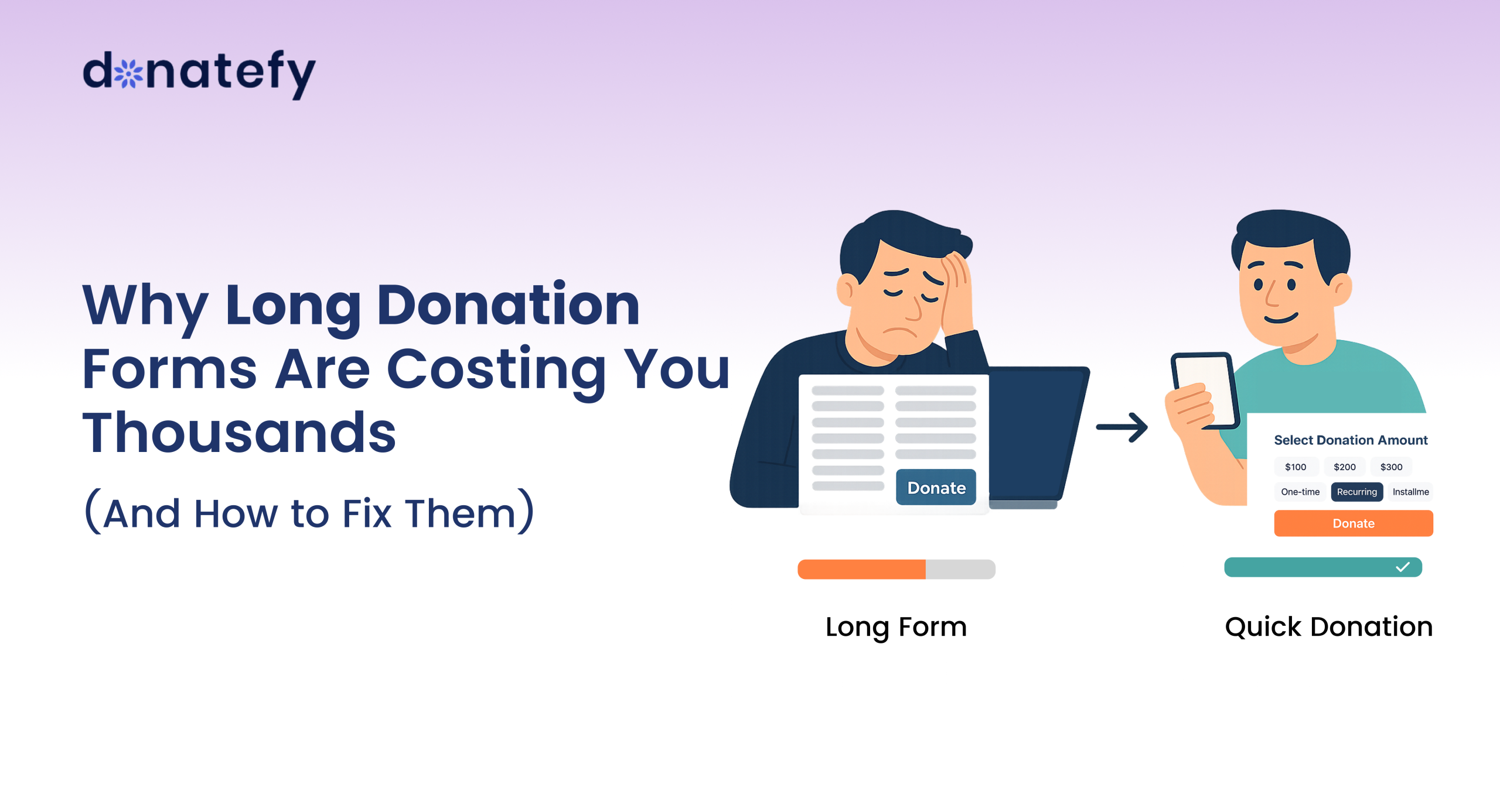
1. Donor Fatigue Sets In Quickly
Imagine a supporter excited to give, only to be met with 20+ questions. By the time they reach the end, they’re frustrated or worse, they give up.
2. Mobile Donors Drop Off
Today, more than half of online donations happen on smartphones. Long forms are even harder to complete on a small screen, leading to higher abandonment rates.
3. Trust Issues Rise with Complexity
When donors are asked for unnecessary details, they begin to question the purpose of the form. Simplicity builds trust, complexity breaks it.
4. Every Extra Step Costs You Donations
Each additional field can reduce conversion rates by up to 10%. Multiply that by thousands of potential donors, and you can see how the losses add up fast.
How to Fix the Problem
The good news? Optimizing your donation form is one of the fastest, easiest ways to boost donations without spending more on marketing. Here’s how:
Keep It Short and Simple
Only ask for what’s truly necessary: name, email, payment info, and donation amount. Everything else can be optional.
Mobile-First Design
Make sure your form looks and works seamlessly on smartphones. Big buttons, fewer steps, and no endless scrolling.
Offer Quick Payment Options
Integrate Apple Pay, Google Pay, and Samsung Pay. Donors love one-tap giving.
Give Flexible Giving Options
Allow donors to choose one-time, recurring, or installment payments. Flexibility increases conversions.
Divide Forms Into Clear Sections
If you need to collect more details, organize your form into short, logical sections (like “Personal Info” and “Payment Details”). Breaking it up makes the process feel easier and keeps donors moving forward without overwhelming them.
Where Donatefy Comes In
At Donatefy, we’ve seen firsthand how shorter, smarter forms dramatically increase giving. That’s why our platform is built with:
- Streamlined, mobile-friendly donation forms designed to maximize conversions.
- Multiple quick-pay integrations (Apple Pay, Google Pay, credit/debit).
- Recurring donation options so supporters can give once or set up ongoing contributions.
- Smart donor data collection (only essential info up front, with the option to capture more later).
- Seamless integrations with your website and fundraising campaigns.
- Real-time tracking & reporting to help you see what’s working and optimize quickly.
- Bank-level security so donors give with confidence.
Your donation form isn’t just a technical detail but it’s a fundraising engine. Long, complicated forms create friction, frustrate donors, and ultimately cost you thousands in lost revenue.
By streamlining the process with Donatefy, you put donor experience first and unlock more generosity, build trust, and raise more funds for your mission.
Because at the end of the day, donors don’t give because of your form. They give because they believe in your cause. Don’t let a clunky form get in their way.
Pro Tip: Audit your current donation form today. Count the fields, test it on mobile, and ask yourself: “Would I fill this out in 30 seconds or less?” If not, it’s time to fix it.
Make Every Donation Count
Don’t let long forms stand between you and your donors. With Donatefy, you can create fast, frictionless, mobile-friendly donation experiences that convert.
Book a demo today and see how easy it is to unlock more donations with smarter forms.